| Author | Message | ||||||||||||||||||||||||||||
|---|---|---|---|---|---|---|---|---|---|---|---|---|---|---|---|---|---|---|---|---|---|---|---|---|---|---|---|---|---|
|
|  Re: Teaser art Re: Teaser art
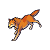
Is this game in the making sort of based on EO? Because that's just the same EO sprite but stretched out, with some new undies, and a couple of bland-ish colors. Why not recreate your own sprite for a change? Dont know, if it was me i would get away from EO completely... Anywayz, it's alright i guess...just not my type of pallete.
--- 申ã—訳ã‚ã‚Šã¾ã›ã‚“~~
|
| Re: Teaser art
To Matt and Hiuru: The "bland" color pallette is purposeful, as skin color is bland and desaturated. It is my personal style, in which i can gain much more detail by having a more "realistic" shading style, where the shadows and highlights are softer on soft materials, darker on dark materials,
hard and sharper on higher definitions, and etc. Metals, for example, will have much sharper, quick changing color schemes. To Matt: yes, i see the issue with the boxers, unfortunately that same curve is counteracted by the angling of the sprite, i'm debating if i'm going to ignore angling for better look.. which i did in some other points, so i likely will. To Hiuru: Stop re-doing my work. It is insulting. You know damned well i do not like your style, and do not want my work to be done in your style. The fact that you feel the need to change people's art to your specific style is just plain arrogant and rude and imposing. ASK permission, if the
person says no or doesn't answer, DON'T do it.
|
| Re: Teaser art
Mr.Gabriel posted: (14th Mar 2011 07:32 am) Okay... --- 申ã—訳ã‚ã‚Šã¾ã›ã‚“~~
|
| Re: Teaser art
Although I like hiuru's better, Gabriel yours are quite good too I just agree with the colours being blandish but if it was done purposely then thats fine,hiuru you should know very well that some artist are very sensitive with there work shame on you. --- If at first you don't succeed; call it version 1.0
|
| Re: Teaser art
i like yours better huira or what you name is not sure looks like a penguin. plus if you want to post your art make your own fourm i think its rude you posted your art in his fourm.
|
| Re: Teaser art
Minerva posted: (14th Mar 2011 03:36 pm) Unfortunately, you've all been exposed to the horrible horrible over-saturated over-shadowed stylings of Matt, Hiuru, Megamoogle, and the people who mimic them, which i have stood by my opinion of disliking since megamoogle first released his style via The Forbidden Gates, and every other time i've seen it. It may look bland as is, but the environment which it will be in and the other things it will be coupled with i'm sure will change your minds.
|
| Re: Teaser art
You guys act as if he committed a crime. Settle down, keep it in your pants. Gabe, don't even go into "rude." There's plenty of occasions where you have been pretty rude also. So don't cry when something as little as this happens. If you dish it out, be prepared to take it.
Ontopic: I agree that Hiuru's looks better, and that if Gabriel would lighten his up/make it brighter, it would look pretty damn badass.
---
Create your own destiny, don't let someone else do it for you.
|
| Re: Teaser art
Deathx posted: (14th Mar 2011 02:51 am)Haze posted: (14th Mar 2011 01:55 am)Deathx posted: (14th Mar 2011 01:51 am)colbymsn posted: (13th Mar 2011 05:53 pm) Your new game? hmm. I would like to hear more about it :D I will want to play :]
|
| Re: Teaser art
AustinB posted: (14th Mar 2011 09:12 pm) I would love to see an example of this "rudeness." When it comes to these forums, i do not sugar coat it, nor do i hold back, i simply am honest. if somebody finds it rude, so be it, that is no fault of mine. And if you're going to quote one of my non-serious, non-sensical blatherings on a lounge topic, then i lol at ye! Also, i see what you guys mean by it being "bland" having used a completely different computer to look at it. My screen's color balancing is different, set up to be specific to printing match. This means that it shows to me on screen how it will look on paper. Your screens settings are likely vastly different, which does end up blanding down the sprite quite a bit. I will brighten it slightly, but do not expect a whole new sprite simply because you all find someone else's artwork better than mine. after all, it is my work, i will do it how i want to.
|
| Re: Teaser art
|
| Re: Teaser art
eochibi posted: (15th Mar 2011 04:36 am) As if i wouldn't :P i'm just having a few issues balancing them out to have good bewbs/butt/hips but still keeping them somewhat proper while trying not to offend women XD
|
| Re: Teaser art
i agree i like hiu's better but gabriels could be real good too but only if everything he pixels for that specific charsheet would be in the same style, otherwise it will look weird --- Qbot/null
|
| Re: Teaser art
@Hiuru Great job, make it little darker & a little off topic do you remember me by any chance? @Mr.Gabriel Add more color, and learn to dither ( remember Google is your friend ) But great job
|
| Re: Teaser art
In my opinion Hiuru's looks kinda like a plastic doll. Everyone has their own styling and Gabriel has chosen what he figures will blend best with the rest of the graphics in Infinite Echo. It looks more realistic to me as do the rest of the
graphics so they look right together. You all may be looking at it based on Endless Online's standard graphics but it isn't intended on being precisely like those. Gabe was posting this to share with you all what can be seen in the near future. He asked me if he should post it on here or not and my
response was no at first. You guys showed why i originally said no :). Either way everyone has their opinions and are free to express them. People just shouldn't take much of what is said to heart. Cheers! ^_^ --- ¨°º¤ø„º°¨ Exile Studios ¨°º„ø¤º°¨
|
| Re: Teaser art
Deathx posted: (15th Mar 2011 03:29 pm) When you put it side by side like that, you can see both of the sprites have there very own strong points and weakness I actually think Hiuru's look more realistic if you take in the how he did the shoulders,legs, and chest that is if your judging solely on realism then Gabriel's sprite is great too far better then whatever I've done or did thanks for the share guys. --- If at first you don't succeed; call it version 1.0 |

 idk..if you're saying ewww then i know what you mean lol i just wanted to give it a try. I hate da legz :l