| Author | Message | ||||||||||||||||||||||||
|---|---|---|---|---|---|---|---|---|---|---|---|---|---|---|---|---|---|---|---|---|---|---|---|---|---|
|
|  Notes and help on what I should improve .... Notes and help on what I should improve ....
Editing: I added my progress from yesterday to today
|
| Re: Notes and help on what I should improve ....
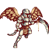
i guess you could try and improve on shading a bit line art was good and try make jus a bit more iso that chainmail on the leg part kinda has to go tho
---
"With your feet steady and firm on the ground soar high and ignore limitations"  -Bladex
EOSERV Class : Pixel Artist, Grammar Nazi, Server Owner, Mapping Artist, Server Coder, Test Player,
The Game Maker
|
| Re: Notes and help on what I should improve ....
Thanks I'm trying to improve. legs there were my biggest problems .. and think it's the shading around the world but trying to improve! Do you know anygood tutorial for shading?_______________________________________________________________________________________________________________________________________ I added some more here
|
| Re: Notes and help on what I should improve ....
So uhm, To C&C Let's start with line art, some of the shape including on the boots were a bit off for me, starting with the V shape on the edges of the extension of the boots, it's partly not isometric but not in a whole but actually it's a bit odd for me though, also the cut on the the shoe and the extension is sorta not formed or pixeled well maybe a little edit would make it looks better. The angles, the angles on the chest plate is a bit aligned on the left and lift up about 1 pixel, you can realign it to make it better. The shoulder is good but on the left part was a bit odd, to make it more realistic pair of should you can use the other as a basis but you should lift it up to make it isometric. Also the cloak, the cloak and cape was sort of big for me, so it's kinda odd in my opinion. So the outline isn't that good, isn't that bad, but performs good outcome as you start pixeling. The shadings and colors, as for me the colors aren't contrasted well, so for my advice try to ask for a starter palette or try reading pixeling tutorials on how to get shades of colors, and for the shadings, it's a bit undeveloped for me in my opinion. I made an edited version of your artwork. =]
Hope you like it. ^^, --- -Facepalm Fest = Win- Hi, I'm Bluee, the Offtopic Prince. Problem?
|
| Re: Notes and help on what I should improve ....
Bluee(Jozh) posted: (2nd May 2012, 07:07 am) I don't like it. It's too white................. Better black.
|
| Re: Notes and help on what I should improve ....
--- "With your feet steady and firm on the ground soar high and ignore limitations" -Bladex EOSERV Class : Pixel Artist, Grammar Nazi, Server Owner, Mapping Artist, Server Coder, Test Player, The Game Maker
|
| Re: Notes and help on what I should improve ....
Funny how I got -1 just because of the color, instead of adding +1 because I C&C, advice, helped, and improved his artwork, I got a degrading reputation. Anyways, I really don't care, it doesn't affect my skills though it's just a simple reduction. Anyways, here is a darker recolor version for the armor.
Hope I won't get an unthinkable reputation reduction this time. xP P.S I love silver. :P --- -Facepalm Fest = Win- Hi, I'm Bluee, the Offtopic Prince. Problem?
|
| Re: Notes and help on what I should improve ....
First his third time that's pretty good I like the out line the Shading needs work and @Blue nice but what if he want the color grey? Try making a grey armor but make the shading better? Or make it gold >=) I wana see a gold one :P
|
| Re: Notes and help on what I should improve ....
Tiduss posted: (2nd May 2012, 03:35 pm)Actually I'm not the type of artist that is recoloring and recoloring again. xD Maybe 1-2 recolors are enough though. xD sorry. --- -Facepalm Fest = Win- Hi, I'm Bluee, the Offtopic Prince. Problem?
|
| Re: Notes and help on what I should improve ....
sorry my english is bad .... Edit:added some details
|
| Re: Notes and help on what I should improve ....
--- Andrewbob - I would be on the fucking copter of rofls Programmer, Web Developer, and Graphics Designer
|
| Re: Notes and help on what I should improve ....
If you wish to improve follow my steps. 1. Fix minor problems with lineart. 2. Make the pure black color a tad lighter. 3. Add a silver type hue rather than a dull gray for metal. 4. Work on shading, and reduce colors. ( stava's tutorial can be found in the forum search and shows a great example.) 5. Now do the work XD.
|
| Re: Notes and help on what I should improve ....
MitchV2 posted: (3rd May 2012, 01:03 am)I also noticed the problem with no.2 xD It will go transparent as it goes on the game. xD Also the last time I used 6 shades of color 2 for outline and 4 for shadings now I'm using 5, 1 for outline and 4 for shadings because of Stava's Tutorial. xD Credits to him though. xD @Roxcast Np, pursue and keep pixeling bro and you'll improve. You have a lot of potential and room for improvements though. Keep learning and pixeling. ^_^
--- -Facepalm Fest = Win- Hi, I'm Bluee, the Offtopic Prince. Problem? |


.png)